ShopDreamUp AI ArtDreamUp
Deviation Actions


Description
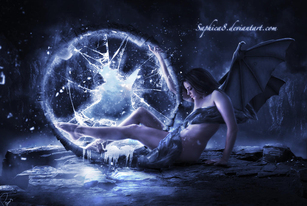
Who's on the other side?  (Smile)")
Model erieye-stock.deviantart.com/ar…
FG ello-stock.deviantart.com/art/…
BG neverfading-stock.deviantart.c…
Brushes redheadstock.deviantart.com/ar… frostbo.deviantart.com/art/Ice… yana-stock.deviantart.com/art/…
Wings nightgraue.deviantart.com/art/…
Cloth geoectomy-stock.deviantart.com…
Gate itsallstock.deviantart.com/art…
Glass particles image kizistock.deviantart.com/art/H…
Thank you all!
Image size
3872x2592px 1.63 MB
Make
SONY
Model
DSLR-A100
Shutter Speed
1/50 second
Aperture
F/4.5
Focal Length
24 mm
ISO Speed
100
Date Taken
Apr 4, 2010, 10:29:37 AM
© 2013 - 2024 Saphica8
Comments131
Join the community to add your comment. Already a deviant? Log In
Great piece!
First I'd like to comment on what I might change, and then on to the parts that I feel are really working.
*The softness of her skin I would consider changing first and foremost. And by that I mean that it's been blurred along the edges quite a bit. In comparison to the surrounding elements, I think she would either need to be in sharper focus, or those elements blurred to match. I doubt you want the latter. I feel that this would help to establish the model into her surroundings better. Also on that note, I would consider reworking the ground shadow below her left hand so that it appears to be planted on the ground. As it is now, it looks as if it's slightly floating (unless of course this is what you're after).
*The Wing stock does have a hole in it, but this is an easy fix with clone stamp if you desire to get rid of it. I think that it would help, because as it stands now, it is slightly distracting because there's nothing of a similar nature (more speckles/holes etc) anywhere else on the wing.
*The darkness on the cloth, just above her belly button, gives a cut away feeling for me. If her stomach area is receiving that much light in that area, maybe the cloth could be brightened just a little to match the lighting and/or cut away slightly to give a curvature/wrapping effect rather than straight across at the angle it is.
*The foreground dust element on the far left edge, just above middle of image, is a little distracting to me. It's a very bright spec, backed by darkness, and I feel it distracts from your main reads in the image, the portal and the girl. Perhaps you were trying to add a sense of depth by having it blurred and close to the camera, but I feel that it's taking away from your composition.
* Lastly, and this is subtle, the cloth could be extended to cover the area where the back leg (right leg) is going past the portal ring. There's a space there, and although it's technically correct, I was still left questioning really fast whether or not the leg was attached. Again, it obviously is attached after closer examination, but maybe something worth exploring <img src="e.deviantart.net/emoticons/s/s…" width="15" height="15" alt="
Now to the things that working for me:
First, most excellent job on the portal! The shards of glass, the sharpness and contrasting light, really grabs the eye. I'm left wondering what's inside, so the impact is great in that aspect.
Your composition is working on a few different levels. I like the way the wings lead us into the image from the right. You also have a nice glow on the back rocks on the left side of the image. They meet directly with the shard of glass in the portal, and create a line for the eye to follow which leads us in, either into the portal or down her leg. It all circles the eye within that area, so really nicely done.
The ice coming up and over the lower part of the portal ring is great. Makes me wonder how long it's been there, and also how long she's been there.
There's a lot of other cool elements going on in this image, like for instance how her back leg is still visible inside of the portal, or her arm breaking through. But I'll leave these to everyone else to ponder about <img src="e.deviantart.net/emoticons/s/s…" width="15" height="15" alt="
Overall great captivating piece, with solid contrast, a cool composition, and great lighting and color!